The Elevation of Color (1976)
Color - the "little guy" of Fine Art Photography
If you could revisit the year 1976, the first commercial flight of the Concorde aircraft cut flying time from London to Paris in half, the company Apple Computer was formed and the very first "Rocky" movie became a picture-show franchise. American culture was also absorbed by an "outsider" US President, Jimmy Carter, who was known for down-to-earth leadership. It could be said the "little guy" and the "little computer" were in, while by contrast "jet-setting" was an ambition of the other half of the economic spectrum.
Color photography in 1976 is perhaps like the "little guy" of fine art photographs, every drug store could sell you some color images. The results were nonetheless washed-out, flattened, and rapidly faded. You could switch to color transparency film and produced a more vivid image, but transfer to print was clumsy, until a product called Cibachrome was introduced. Cibachrome matched the characteristics of the positive films (and in particular, Kodachorme, was best positive film around, if you could live 25 ASA).
One problem was that Cibachrome didn't really look like a photograph. Its polyester substrate of 14 dye layers, and the resulting "slick" surface did not readily appeal to fine art photographers who measured print quality by comparison to B&W gelatin silver coated paper. Even 'glossy' B&W paper had a more muted, subtle surface - often with a deep fibrous, organic texture. Cibachrome's surface was almost like a mirror; because of slow adoption by photographers, the manufacturer produced a 'mat' surface option, yet 'mat' appeared muddy - rebuking the advantages of the product.
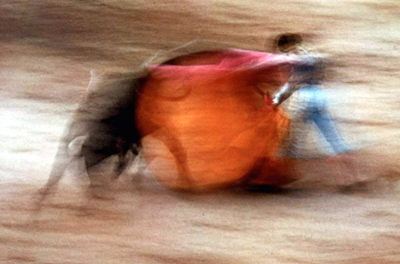
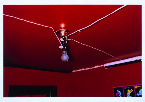
(Below) Ernst Haas, La Suerte De Capa, Pamplona, Spain, 1956 and William Eggleston, The Red Ceiling, Greenwood Mississippi 1973 - both early color images exhibited at MOMA.
Dye Transfer Print Process Becomes the Rival to B&W
A much more complicated, yet similarly permanent color print making process is Dye Transfer, where color separations are developed from the original transparency, then dyes are extruded from the separations to the print surface, layer upon layer. With chemically inert inks and archival paper, a stable image could be made with vibrant color yet devoid of the "plastic" nature of Cibachrome's polyester sheen.
It was the permanence of these color processes that allowed color to elevate in importance as a fine art; black and white images had already achieved permanent, archival processes. Archival silver gelatin prints, last more than 100 years, and could be spawned from any laundry room or coat closet converted to darkroom. Barriers to B&W fine art prints were few. And paper stock was plentiful, for example photographic B&W papers like Agfa Portriga Rapid set the standard in silver halide density - creating a three dimensional image depth complementing the relatively larger latitude of B&W films compared to color.
Color transparency film was intolerant to over-exposure, creating bleached out highlights, while B&W films could be coaxed into nine distinct tonal ranges or 'zones' from white to black by exposing for shadows and developing for highlights using highly diluted developing solutions. In short, B&W could be mastered at home while color needed processing by commercial labs. Add to this the complication that Dye Transfer prints were approximately ten times the cost of the best B&W processing commonly available - and again entrusted to only a very few specialized labs.
Dye Transfer prints took 8 hours to construct a single image, and Cibachrome's caustic processing chemicals made vibrant color prints unavailable to all but a small group of experienced professionals and photographic hobbyists.
It was against these odds that photographers like Ernst Haas, William Eggleston and Elliot Porter began to make contemplative and controversial color images which captivated the common public and art connoisseur alike.


Masters of B&W photography created a fine art standard by which color prints had to compete. The luminous tones and gritty contrasts produced a tonal range difficult to capture in the flatter contrasts available to color processes.
- Richard Avedon - Dovima with Elephants, 1955 / upper left
- Bill Brandt - Nude, Campden Hill, London, 1949 / upper right
- Mary Ellen Mary - Tiny, from the series 'Streetwise', 1983 / lower left
- Irving Penn, Freckles (series), 1960s / lower right
(Note: images cropped to 2:3 aspect ratio. Click for original perspective.)
1976 - MOMA William Eggleston Exhibit
The most important contemporary fine art exhibit of color photographs came in 1976, in an exhibit curated by John Szarkowski of the work by Mississippi photographer William Eggleston. The work was extraordinarily controversial, not only because it was in color, but because of its cultural, message-ladened content.
Perhaps the most derisive of these images was the Red Ceiling, seemingly framed in an accidental manner with a moment stolen from a boudoir motel of garish color and even more garish electrical wiring. It was a fire marshal's nightmare in fire engine red. Right behind enigmatic content was the seemingly impossible density of the red color of the ceiling. Whereas today any post-processing software can adjust hue and saturation to extreme, in early 1970's photography the color red was extraordinarily challenging to capture. As described by Eggleston during a speech given at the J. Paul Getty Museum at the Getty Center, during the exhibit William Eggleston and the Color Tradition (October 26, 1999 to January 30, 2000):
"The Red Ceiling" is so powerful that, in fact, I've never seen it reproduced on the page to my satisfaction. When you look at a dye-transfer print it's like it's red blood that is wet on the wall. The photograph was like a Bach exercise for me because I knew that red was the most difficult color to work with. A little red is usually enough, but to work with an entire surface was a challenge. It was hard to do. I don't know of any totally red pictures, except in advertising. The photograph is still powerful. It shocks you every time.
- Image of William Eggleston
The irony of Eggleston's landmark exhibit of color photography, is that it was predated by 14 years at MOMA in the exhibit of Ernst Haas, a celebrated photojournalist and president of Magnum, a famous group of freelance photographers. Haas is often described as a working professional whose occupation allowed him to engage in personal work, like that in his first solo exhibit of color photography at Moma in 1962.
As in the later Eggleston show of 1976, John Szarkowski was likewise the curator of the Haas show in 1962. The press release for the precursor color exhibit described Haas as a poet and visual aesthete:
For Haas, color photography is a new "philosophy of seeing"; it is not journalism, but a visual poetry. As Mr. Szarkowski writes, "The color in color photography has often seemed an irrelevant decorative screen between the viewer and the fact of the picture. Ernst Haas has resolved this conflict by making the color sensation itself the subject matter of his work. No photographer has worked more successfully to express the sheer physical joy of seeing."
- Image of Ernst Haas
Yet Haas and Eggleston couldn't be more different photographers, nor could they take more different photographs. The only thing in common between the men was Kodachrome and Dye Transfer prints.
When Haas began using Kodachorme in the 1950's the frequent outlet was National Geographic, Life, Look, and Collier's magazines - each early adopters of color in mass publications. As Szarkowski is quoted above, Haas used color as a sensation and with impressionistic, joyful subject matter - yet Eggleston used color as a cipher to symbolism embedded deep within American Culture and as a palette for the photographer's own sardonic mindset. Eggleston's esthetic was the underbelly of culture; queer and often quiet moments of human existence - compelling subjects desperately in need of visual interpretation. Against the odds and in opposition to the state of B&W as the reference for fine art, he created a psychological and possibly pathological artist reference point which echoed the Diana Arbus exhibit at MOMA just four years earlier. But he did so in color.
From this point forward, pigmented images were added to the standard of fine art photography, and for this reason alone the 1976 MOMA exhibition of Eggleston's work marks the elevation of color.
One reason color was held in reservation as a fine art, can be seen further in the comparison of La Suerte De Capa (Haas on Bullfighters) and The Red Ceiling (Eggleston on Brothels). In vernacular style, they are very different expressions of color photography. Eggleston used the raw saturation of color to transfer a social and psychological meaning. Haas used conventions of photographic medium (blur from slow shutter speed) to create painterly impressions that are mimetic of Degas ballerina paintings seventy years earlier, or even of Claude Monet's colorful interpretations of House of Parliament at Sunset, painted in 1903.


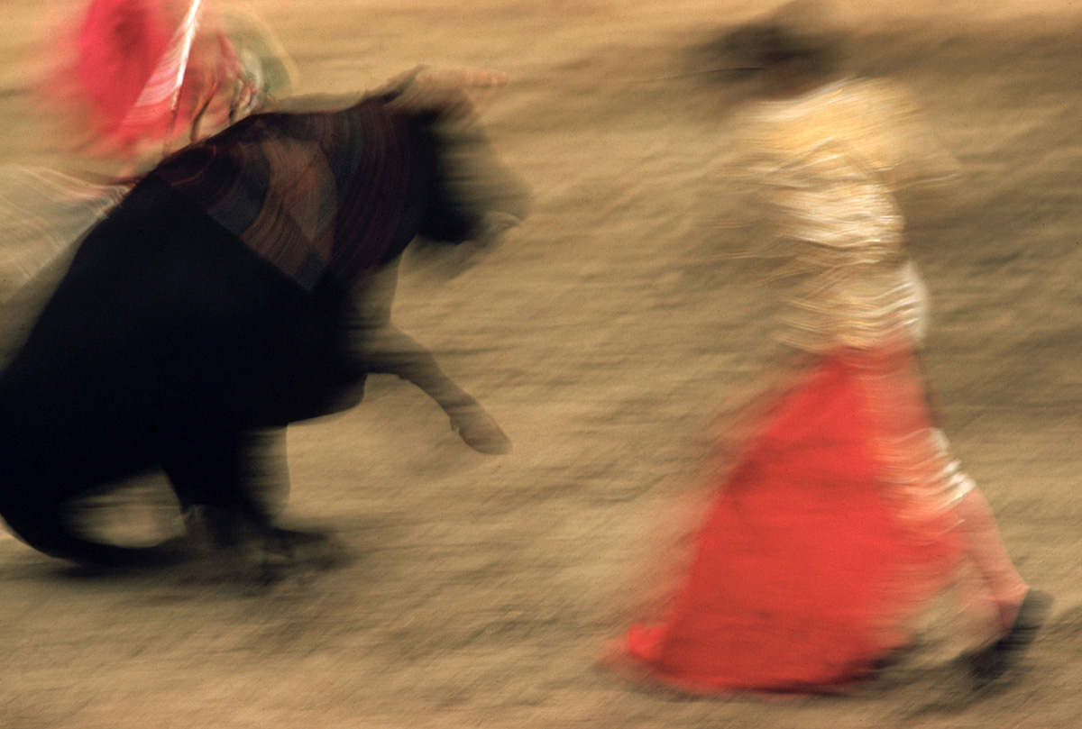
(Above) Painterly characteristics used by Ernst Haas, in the book The Creation. Impressionists Degas and Monet (on top, left/right) may be readily compared to Haas's series on bullfighters from Pamplona, Spain, 1956.
(Note: images cropped to 3:2 aspect ratio. Click for original perspective.)
The Creation - Color Photography's Most Popular Tome in 1971
In 1971, Haas published The Creation, a book of color images of the same faux-painterly style as the MOMA show of 1962. Selling more than 350,000 copies it places Haas in a group of the 10 most famous photographers of all time. The public celebrated the sublime images of nature and rich use of color which was vastly unavailable to household images processed at the neighborhood drug store.
A further comparison of Haas to Eggleston is also found in varied occupation and preoccupation. Haas worked commercially to afford the pastime of art making while Eggleston was born an aristocrat whose muse was image making. Thus Eggleston's vision was never tempered by economic need or commercial occupation. He was afforded greater visual license, and used this freedom for creative expression using color in photography, that was yet untested. It has been said there is an element of evil in a Eggleston photograph. In contrast The Creation was created as an interpretation of the book of Genesis, it is clear no nefarious element crosses the lens of Haas.
The Creation received widespread critical acclaim. It was popular, easily digested as 'painterly' and inspired by heavenly creation. Compare this to the vile and repulsive regard for Eggelston's exhibit, which the New York Times called "the most hated show of the year", and Hilton Kramer, loftily countering the curator's assertion that the show was in fact perfect, wrote "perfectly bad, perhaps… perfectly boring, certainly". (Source: Genius in colour: Why William Eggleston is the world’s greatest photographer, The Independent, 2013.)

Critics struggled to find discourse in which to categorize Eggleston's MOMA show in 1976, just as they did two decades earlier in review of the Robert Frank's 1958 book, the Americans. Today reviewers often describe an element of longing, foreboding and even evil to the underlie color-saturated imagery by William Eggleston. Untitled, 1974 (Biloxi, Mississippi)
Elliot Porter - Nature Photography's Dye Transfer Doctor
In tracing the elevation of color photography surrounding the period of William Eggleston's 1976 exhibit at MOMA, Elliot Porter deserves recognition as the most important nature photographer to begin working almost exclusively in color. Unlike Haas or Eggleston, Elliot was the consummate color craftsman - working in large format transparency films and creating his own large-scale separations for Dye Transfer. I visited Elliot in his studio in Sante Fe, NM in 1982 and witnessed rooms of separation stations, most in production 30x40 inch prints.
Elliot was Harvard educated as a physician yet made an abrupt shift upon showing his early B&W work to Alfred Stieglitz and being exhibited in 1938 at An American Place gallery. He shifted to use of Kodachrome in the 1940's and adopted nature as the subject of his photographs for the remainder of his life - even for a period serving as president of the Sierra Club. It was here in 1962 that his book In Wildness Is the Preservation of the World was published - combining the words of David Thoreau with his own images of New England woods. It became one of the first, and certainly the most popular book of color nature photographs of its time.
Like Haas, Porter worked in a vernacular of photography which appealed to broad sections of the population - yet unlike Haas, Porter made no attempt at painterly interpretation. Instead, like Thoreau, he found transference in nature. Deeply analytical in approach, in the 1990's Elliot's transcendent ideas of nature evolved into a photographic interpretation of Chaos Theory.
Elliot Porter's In Wildness Is the Preservation of the World (1962) was the earliest and best known book of color nature photography. Later he partnered with James Gleick in the book Nature's Chaos (1990), expanding on the theme of the higher order within nature, in reaction to the urbanization of America.
Chromogenic Prints and the work of Stephen Shore, Robert Misrach and Joel Meyerwitz
Despite the attention given to permanence and archival processing of color images by contrast to B&W, Chromogenic Prints or "C-Prints" were a significant part of the elevation of color, despite the more muted appearance and care required for conservation. Cold storage rooms were created in museum's like the Art Institute of Chicago for storage of Chromogenic Prints, where the largest collection of Joel Meyerwitz images resides. Heat and ultaviolet light degrade the silver halide surface of C-Prints, and reduce the density of color while also introducing a yellowing as the resin paper base chemically shifts.
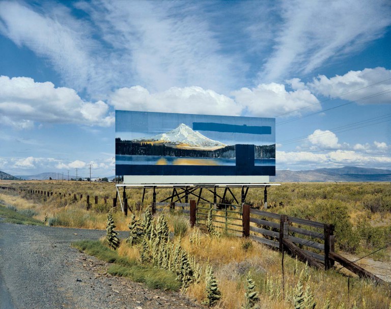
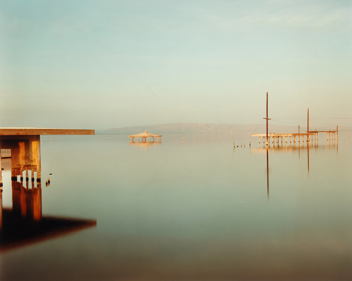
(Above/left) Federal Highway 97 south of Klamath Falls, Oregon 1973 by Stephen Shore 1973. (Middle) Submerged Gazebo, Salton Sea, California 1984 by Robert Misrach. (Right) New York City 1963 by Joel Meyerowitz.
(Note: images cropped to 4:3 aspect ratio. Click for original perspective.)
Bucking the pursuit of permanence, some fine art photographers chose Chromogenic Prints given the larger number of labs available, larger sizes and lower costs. The asthetic of a more muted color appealed to the sensibilities of fine art photographers who began shifting from earlier B&W work, best known were Stephen Shore, Robert Misrach and Joel Meyerowitz - with many other early adopters like, Gary Winogrand, Jim Dow, Fred Herzog, and Patty Carroll.
Elevating Color
Until the mid 1970s, the color photo was not a form of fine art; the reasons were simple - cost and perceived quality. B&W photographic prints had wide tonal ranges and many kinds of surface treatments, with processing available at home. The vernacular of fine art photography began to change with transparency films, especially Kodachrome, and the do-it-yourself Cibachrome. Dye Transfer, however was the more photographically appealing as it mimicked the surface of B&W - especially as compared to the 'slick' polyester Cibachrome print, and its mirror-like surface.
Although Ernest Haas and Elliot Porter gained national attention in works of color, it was Diana Arbus's MOMA show in 1971, that began a discourse among photographers. Compelling, physiological (and even perceived pathological) imagery of Arbus captured enormous critical attention. It was upon this attention that the Southern aristocrat William Eggleston added color to the discourse. He was the jet-setter who took an overlooked medium - a "little guy" like color photography - and bucked the decades old dominance of B&W photography.